Tata Data Visualisation Virtual Experience
I recently had the opportunity to participate in the Tata Virtual Experience program, where I took on the role of a data analyst. This experience allowed me to apply my skills in data analysis, visualisation, and business communication to a real-world scenario.

Understanding the Business Context
My first task was to understand the business context. I was engaged by an online retail store to review their data and extract insights for the CEO and CMO. The company was experiencing success, but they wanted to understand the key drivers of their revenue to plan for the upcoming year. The leadership was considering expansion, so they needed insights into both operational and marketing metrics. They were particularly interested in metrics based on different customer segments, given the demographic information available in the data.
Framing the Right Questions
With a clear understanding of the business context, my next step was to anticipate the questions that the CEO and CMO might ask. This exercise helped me focus my analysis on the most relevant areas. Some of the key questions I formulated included:
1. What are the seasonal trends in revenue?
2. Which countries are generating the highest revenue?
3. Who are our top customers by revenue?
4. Which regions show the highest demand for our products?
Data Cleaning and Preparation
Before diving into the analysis, I needed to ensure the data was clean and reliable. This involved:
1. Identifying and addressing data anomalies, such as negative quantities and erroneous unit prices.
2. Implementing conditional Excel formulas to filter out irrelevant data.
3. Standardising data formats for consistency across the dataset.
Data Visualisation
With clean data in hand, I moved on to creating visualisations using Power BI. I focused on addressing four key questions:
1. Revenue Trends: I created a time series visualisation of monthly revenue for 2011, helping the CEO understand seasonal trends.
2. Top Revenue-Generating Countries: I visualised the top 10 countries by revenue and quantity sold, excluding the United Kingdom as per the CMO's request.
3. Top Customers by Revenue: I created a visual showing the top 10 customers, arranged from highest to lowest revenue generation.
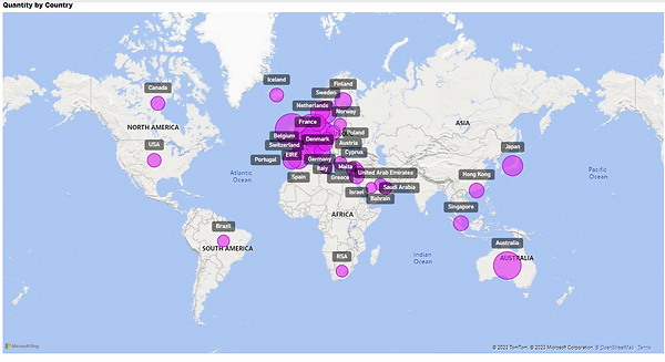
4. Product Demand by Region: I developed a visualisation showing product demand across all countries (excluding the UK), to support the CEO's expansion strategy.
Communicating Insights Effectively
The final step was to communicate my findings to the CEO and CMO. I recorded a video presentation that walked them through:
1. The data loading and cleaning process
2. Each visualisation and its key insights
3. How these insights could inform their strategic decisions
I made sure to focus on the information most relevant to their leadership roles, presenting a clear and concise summary of my analysis.
Conclusion
This experience with the Tata Data Visualisation Virtual Experience program was invaluable. It allowed me to apply my technical skills in data analysis and visualisation to a real-world business scenario. More importantly, it taught me the importance of understanding the business context, asking the right questions, and communicating insights effectively to senior leadership.
I'm excited to apply these skills in future projects and continue growing!